
CSS
- Basics
- Usage tips
- Quick reference
- Examples
Cascading Style Sheets (CSS) is a simple method to control style (fonts, colors, content layout) in web documents, enabling updates to an entire site display by changing a single file.
-
-
- Tables. Nested tables. Tables within tables within tables.
If you wanted to have more than a top-to-bottom display, content formatting was managed with nesting text and/or images within tables. Sounds like no big deal? Try nesting multiple tables within tables. It can get tedious.
Not to mention the fact that any changes to site layout must be updated on each and every page. That's ok if you have four or six pages in your website. Oh? You have hundreds, you say? Educational sites, business and retail sites often have far too many pages to manage formatting with tables.
Separate CSS files are updated easily and quickly. Fluid or fixed layouts, the positioning of each element of the page(s) is within easy control. While it is an option to place CSS in between the head and head tags on the page, one of the biggest benefits of using CSS is that you can define a style for each page in the site in its separate file, making changes/updates fast and easy.
-
- CSS enables multiple formatting options within each page, if needed. Total control...or as close to total control as you're going to get in a world in which there seems to be little to no standards compliance with browsers.
-
-
-
- Get a good mental image first.
Got it? Good. Now draw it. It will help. Use your drawing to position elements as you want them. It will make it easier to follow your design ideas. If you don't have access to Photoshop, Corel Paintshop is usually about $30. And all Windows computers come with Paint, which is sufficient. It doesn't need to be fancy or intricate - just functional.
-
-
-
- 1 - Logo
2 - Banner
3 - Menu
4 - Main content
5 - Footer
Typically these are the minimum elements to position.
-
-
-
- The selector is the HTML element you want to style.
Each declaration consists of a property and a value.
The property is the style attribute you want to affect.
Each property has a value.
selector {property: value;}
Please note: The space between the colon after property and the value is not required, but only used to make reading easier.
selector = element of the page that I want to affect.
property = specific characteristic I want to control.
value = defines what I want that characteristic (property) to display.
What does this mean? Look at it again with parameters:
I want the default background color of the page to be blue.
body {background-color: blue;}
Real world examples:
I want to 'create' a cat with green eyes.
cat { eyes: green; }
In the world I'm creating, the default color of the sky is blue.sky {background-color: blue;}
Please note that property: value is enclosed within curly brackets: { and }
Another syntax note:A semi-colon is required at the end of the statements.
Nested elements:
Example:
background {font-family: Georgia, "Times New Roman", Times, serif; font-size: 14px; font-style: italic;}
Spacing is useful for easy reading.
background {
font-family: Georgia, "Times New Roman", Times, serif;
font-size: 14px;
font-style: italic;
}Nested elements inherit the properties of the parent element unless you specify otherwise.
Just as an example, because it's doubtful that we'd want to actually use different font families in each heading element (Remember that just because we can do a thing doesn't always mean that we should), this will render all text within the body as Verdana except the listed headings that specify otherwise:
What does that mean? The body selector contains many page elements within it - all displayed page elements are within the body. Therefore, if you set the font-family to Verdana in the body, all text ...headings, links, and content text... will be rendered as Verdana unless you specify otherwise in the nested elements.
Example:
body {font-family : verdana;}
h1 {font-size: 18px;}
h2 {font-size: 16px;}
h3 {font-size: 14px;}
h4 {font-size: 12px;}
Headings in the example do not specify font family, so will display as Verdana because the heading elements are contained within the body element.
body { font-family: verdana;}
h1 {font-size: 18px; font-family: "Courier New", Courier, monospace;}
h2 {font-size: 16px; font-family: "Times New Roman", Times, serif;}
h3 {font-size: 14px; font-family: "Courier New", Courier, monospace};
Combining selectors:You can combine elements within one selector when they share the same the same properties: values.
h1, h2, h3, h4 {
color #009900;
font-family: Georgia, sans-serif;
}
-
-
-
- /* This is a comment */
In a CSS file, any words between /* and */ are ignored by the browser. This allows us to add helpful notes to help others understand the code as well as helps us to quickly move through our own code at a later date.
-
-
-
- Cascading Style Sheets ... cascade. Simply put, the styles are applied in the order they are read by the browser. Style1 is applied, then Style2 - and so forth. This means that if a style is used at the top of a style sheet and then is repeated with a different attribute down in the document, the second instance of that style will be the one applied, not the first.
What?
If you define font color as blue in an element and then define it again as red afterwards, the last definition applies.
body {
color: blue;
color: red;
}
We'll discuss CSS specificity in a bit...
-
-
-
- What if we want a single section styled differently? There is more than one way to accomplish this, depending on need.
Is this different style used once?Let's say that font color is defined as blue, but a single area should have red font.
Is this different style going to be repeated?
Inline CSS style is useful here. Please use sparingly.
<p style="color: red;">The text in this paragraph will be red.
</p>
This can be applied to any page element. Paragraph, <p> </p>, is only one example.In this case, it's useful to create a class for the alternate style that can be applied to specific elements.
Why was !important used?
Example:
We have a standard font color set in the body element as blue.
body {
color: blue;
}
The body font color attribute is overridden by using a class
.redFont {
color: red !important;
}
To use this class in the HTML page:
<p class="redFont">Any paragraph with the class redFont will use red font.
</p>
In fact, any element can be affected by a class definition. Note others:
<h4 class="redFont">This is Heading 4</h4>This is Heading 4
<a class="redFont" href="">This is an affected link</a>
This is an affected link - The link url is empty so it will only reload the page.
!important adds more weight to the declaration. This makes it possible to override the parent element declaration: body {color: blue;}
Note that !important is inserted at the end of the statement, but before the semi-colon.
More on classes in the Quick Reference tab...
-
Usage tips
-
-
- <---------
-
- ---------
-
-
-
- --------
-
-
-
- ---------
-
-
-
- ---------
-
-
-
- ----------
-
-
-
- --------------
-
-
-
- -----------
-
-
-
- ----------
-
-
-
- ---------
-
-
-
- ---------
-
-
-
- ----------
-
-
-
-
selector {
background-color: white;}
Example using paragraph as selector
Yes. :-) It's a short paragraph.
And yes, to override the parent selector attributes for this example, I used !important. Not needed except to override. Also not needed if you count element names, pseudo-classes and other non-ID attributes in the selector and do the math to calculate specicifity...read more in Usage tips.
-
- Using a blue and black gradient background image. See original >>>

selector {background-image: url(exampleBgImage.png);}
Example of background image used in a paragraph.
See another way to use a vivid background while displaying text/content in an easily readable format under Divisions - container uses...
Note that without further definition, the background image will tile, if necessary, to fill the area. Very distracting.
In fact, any background image can be distracting, making it a chore to read the text. Further definition is needed, depending on the background image, to avoid distraction.
White font was necessary just to read the text.
-
-
- CSS 3
selector {
background:url(exampleBgImage.png);
background-size: cover;
background-repeat:no-repeat;
}
Background-size options are:
length: Sets the height and width of the background image. The first value sets the width, the second value sets the height. If only one value is given, the second is set to "auto"
Example:background-size: 200px 60px;
percentage: Sets the height and width of the background image in percent of the parent element. The first value sets the width, the second value sets the height. If only one value is given, the second is set to "auto"
cover: Scale the background image to be as large as possible so that the background area is completely covered by the background image. Some parts of the background image may not be in view within the background positioning area
contain: Scale the image to the largest size such that both its width and its height can fit inside the content areaExample in a paragraph selector using the property value: cover.
Yes, this is a short paragraph.
The background-size property is supported in IE9+, Firefox 4+, Opera, Chrome, and Safari 5+.
-
-
-
- selector {
background-position: center;
background-size: 600px 40px;
}
This short paragraph illustrates options to position a background image, set it not to repeat (tile), and set its size.
The size specified for this background image is 600px x 40px.
The actual size of the image is 22px x 20px.
To make it easier to read, the backgound-color is red and font color is white.
This example displays horribly, but shows possibilies. With a little thought, it could be used to create a nice effect.
-
-
-
-
- Although search engines change their mind more than a teenager, they like heading tags.
This is the best reason to use headings, and use them in the correct order - ie. h1, then h2, then h3, etc. Search engines give highest weighting to text included inside heading tags, because there is a semantic value to that text. Labeling your page title H1, tells the search engine spider that this is the number one focus of the page. H2 headings have number two emphasis, and so on.
But...standard headings are too big, plain, and clunky. They remind me of the old free Angelfire websites when folks were just beginning to dabble with HTML. We'd like control of heading display. CSS gives that control.
First, let's look at standard heading displays.
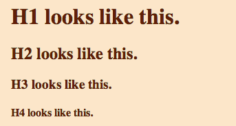
Ewwww! Right?
So style your headings to match the layout of the site that you're worked on so hard!H1 modified by CSS
h1 {
font-family: Georgia, "Times New Roman", Times, serif;
font-size: 16px;
color: #339;
text-align: left;
}H2 modified by CSS
h2 {
font-family: Georgia, "Times New Roman", Times, serif;
font-size: 14px;
color: #339;
text-align: left;
}H3 modified by CSS
h3 {
font-family: Georgia, "Times New Roman", Times, serif;
font-size: 12px;
color: #339;
text-align: left;
}H4 modified by CSS
h4 {
font-family: Georgia, "Times New Roman", Times, serif;
font-size: 10px;
color: #339;
text-align: left;
}
-
-
-
- Style links exactly as you would like! (Thank you, CSS!)
/* unvisited link */ a:link { color:#611f06; } /* visited link */ a:visited { color:#FCE6C9; } /* mouse over link */ a:hover { color:#FF00FF; } /* selected link */ a:active { color:#0000FF; }
- Style links exactly as you would like! (Thank you, CSS!)
-
-
-
- --------------
-
-
-
- -----------
-
-
-
- ----------
-
-
-
- ---------
-
-
-
- ---------
-
-
-
- ----------
-
-
-
- ----------
-
-
-
- ----------
-
-
-
- ----------
-
-
-
- ----------
-
-
-
- ----------
-
-
-
- ----------
-
-
-
- ----------
-
This section illustrates examples of css format manipulation. Please click folders below to view information.
-
-
- <---------
-
- ---------
-
-
-
- --------
-
-
-
- ---------
-
-
-
- ---------
-
-
-
- ----------
-
-
-
- --------------
-
-
-
- -----------
-
-
-
- ----------
-
-
-
- ---------
-
-
-
- ---------
-
-
-
- ----------
-
